I really encourage you to check out the link for some great graphics, but if you'd rather not, here are some of my favorites:
(related to the Cold War)
#49. I can't post a screenshot because it's a gif, but the interactive map that demonstrates the path of the Vietnam War.
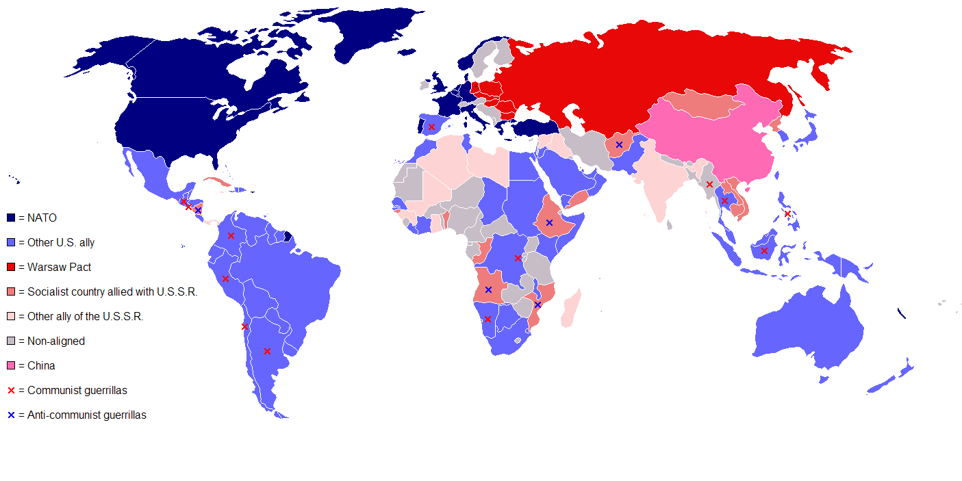
#50. A great way to visualize the extent to which countries identified either as communist or capitalist. The world was almost at a stalemate.
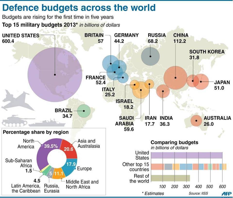
#54. "Another way to show America's status as the sole global superpower is its military budget: larger than the next 12 largest military budgets on Earth, combined. That's partly a legacy of the Cold War, but it's also a reflection of the role the US has taken on as the guarantor of global security and the international order."
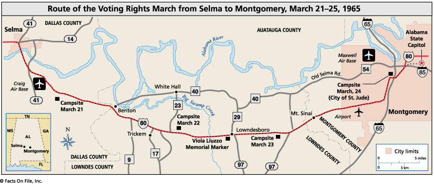
#40. With the 50th Anniversary of Selma being timely at the moment, this map helps people visualize the route taken.
Basically all of them are super cool and you should check them out!!
Hey Julia! I absolutely loved these links to the graphics. For me the most interesting one was the one about the defense budget from 2013 that you had mentioned in the post. Especially learning about the Cold War right now, it seemed crazy to me that the US was still leading by THAT much in the defense budget. I knew that we spent lots of money on our military budget, but I didn't realize that countries weren't even close to our spending. I also thought it was fascinating that Russia comparatively dropped off the radar in relation to our spending. In just the past few decades Russia managed to drop from our largest defense competitor to a spender significantly behind China at $112.2 billion. It also scares me a bit that the US almost doubles the defense spending of the rest of the world (that isn't a part of the top 15).
ReplyDeleteI think that visuals are super important in learning how significant statistics are. I have a hard time understanding the extent of a number until I see it in context like from these. This was also a good tie-in to what we were learning in AP Lang for our speech unit - cool way of doing interactive learning!
Thanks again Julia!